Page Layout
Magazine SpReads
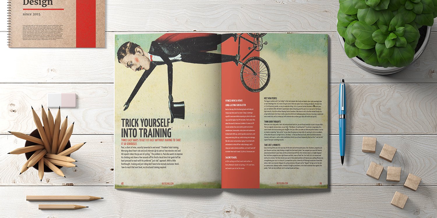
These 3 spreads were a school project I designed in 2012 and I decided to keep them in my portfolio because I love how they turned out. This is the first spread and I loved manipulating the black & white line art on the right page to match the art on the left page. I’m constantly trying to add small details into my designs to improve them.

For this magazine spread, I separated the image art from the background and used the art to “present” the article title.
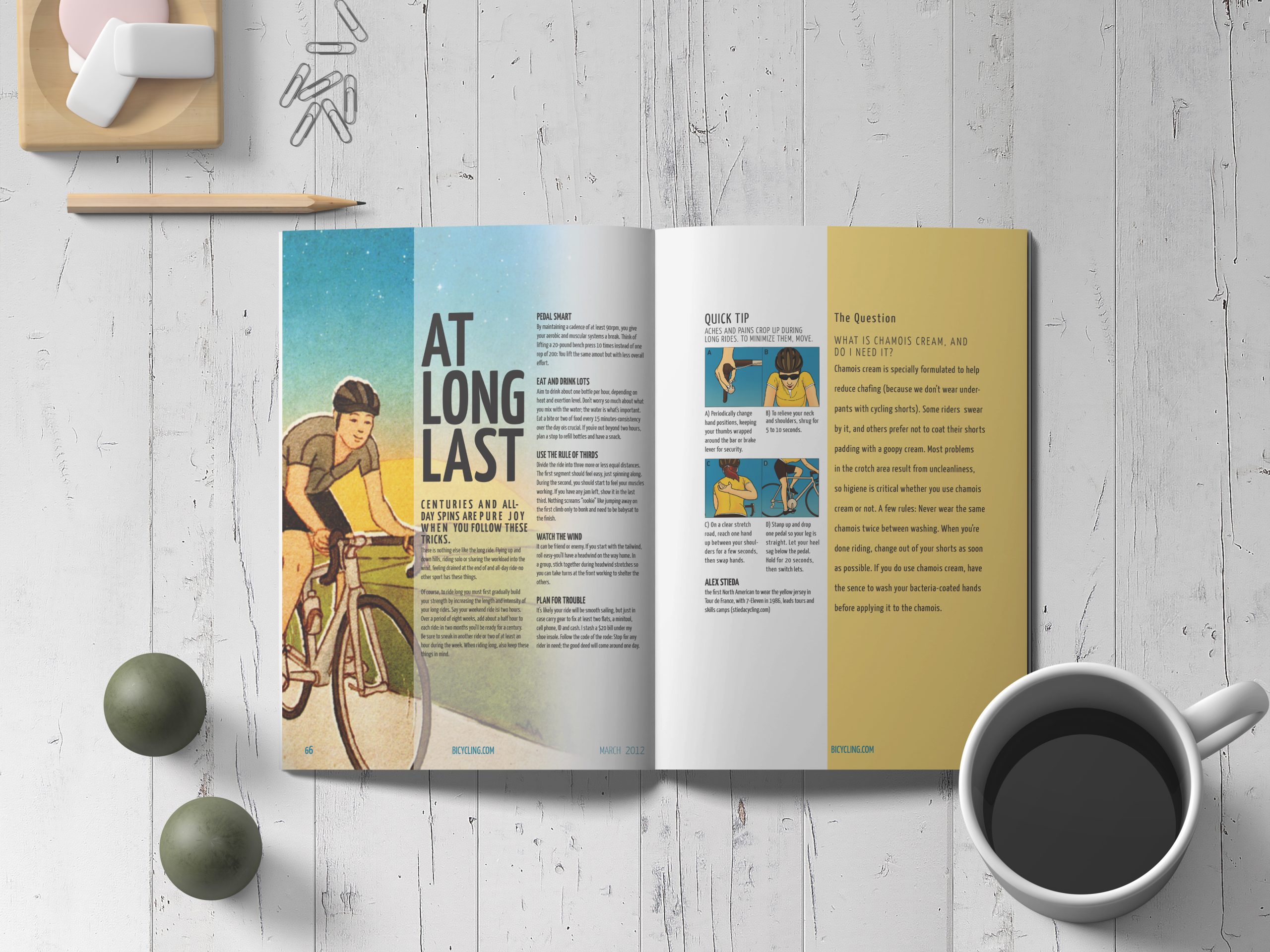
On the last magazine spread, I made the cover image fill the whole page and used a gradient to make the text readable. The original art for the Quick Tip was black and white line art so I decided to paint the graphic in Photoshop to match the art on the opposite page.
RELATED PROJECTS